I had an old hard drive lying around so I thought I would take the SSD out of my laptop and install a “leaked” copy of the forthcoming Windows 8.1 (AKA Windows Blue). This isn’t really a review, it’s just some thoughts about it. I didn’t use it for very long so it’s really my first impressions. The version that I installed wasn’t even an official preview so it’s quite likely that by the time it gets released it will be at least a little bit different. It was also missing some key features like the ability to activate it and do Windows updates.
It’s worth mentioning that I have hardly used Windows 8 (apart from a brief look at the official consumer preview just before the final release) so 8.1 might not be very different. I’m really not sure.
Installation
The installer was very much the same as the Windows 7 one. I wasn’t doing any complicated partitioning, I just let Windows install to the entire hard drive. It all went fairly smoothly but it took an awfully long time compared to Xubuntu which wasn’t a surprise. It definitely took longer that Tiny7, a slimmed down version of Windows 7 that I use for audio work, despite being fairly stripped down itself. It did freeze at the final stage of the installation but after a hard reboot it booted into the OS. Presumably once the final version is released this won’t happen.
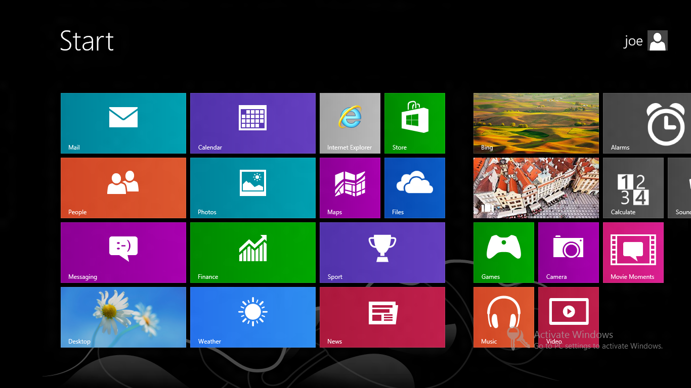
The start screen
Once it boots, you are faced with the same start screen that comes with Windows 8:
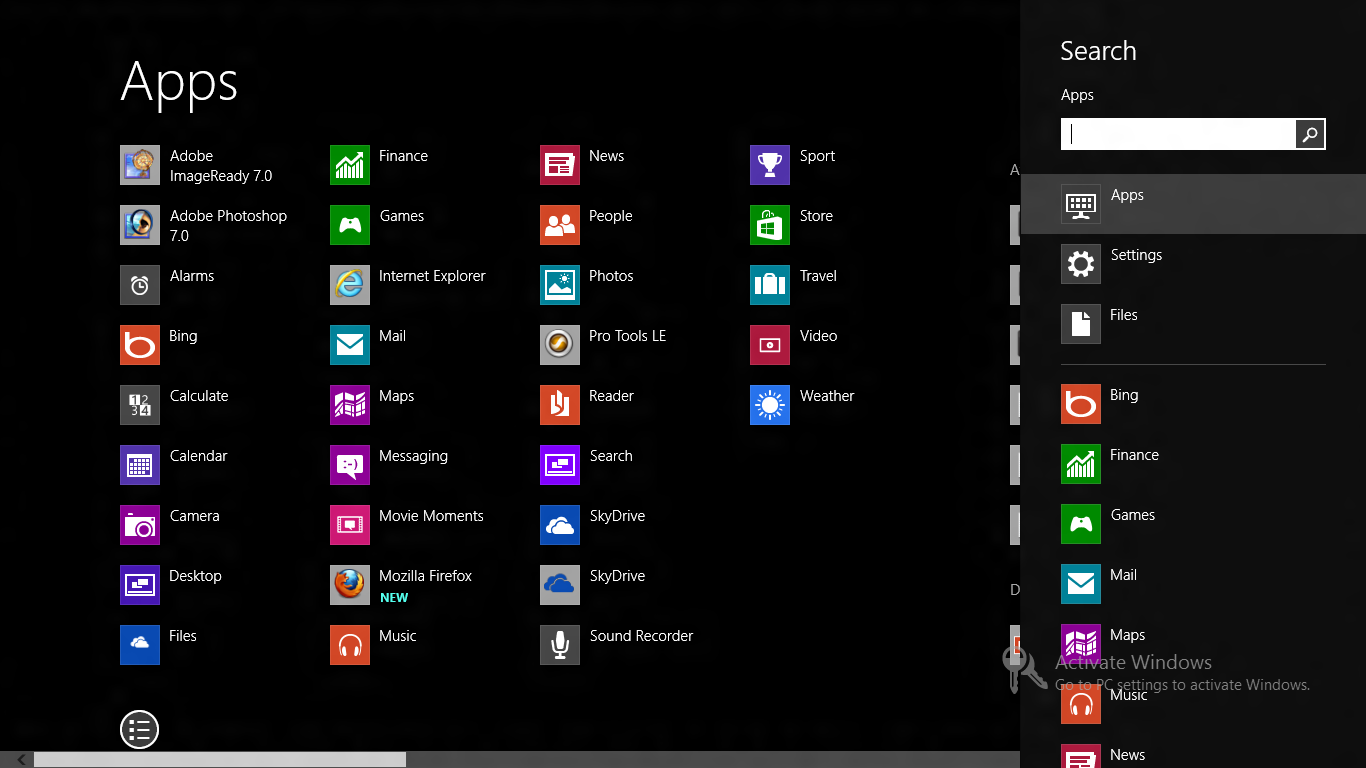
At this point you have several options. You can press escape (or the old Windows key + d) or click on ‘Desktop’ to go to the desktop or you can start typing to bring up the app search. You can also click a button that brings up an Android style ‘app drawer’:
What is there to say about this new approach to interface design that isn’t blindingly obvious and hasn’t been said already? It’s obviously complete and utter shit and whoever came up with Windows 8 should be fired. To be honest I blame the developers of Gnome shell and Unity for this hideous mess. The world is moving away from traditional desktop computing towards touch screen content consumption devices like phones and tablets. As a result of this shift, developers of desktop operating systems are desperately trying to keep up by copying UI elements that clearly don’t work with mouse and keyboard based input. Thank fuck for lighter weight Linux distros and desktop environments.
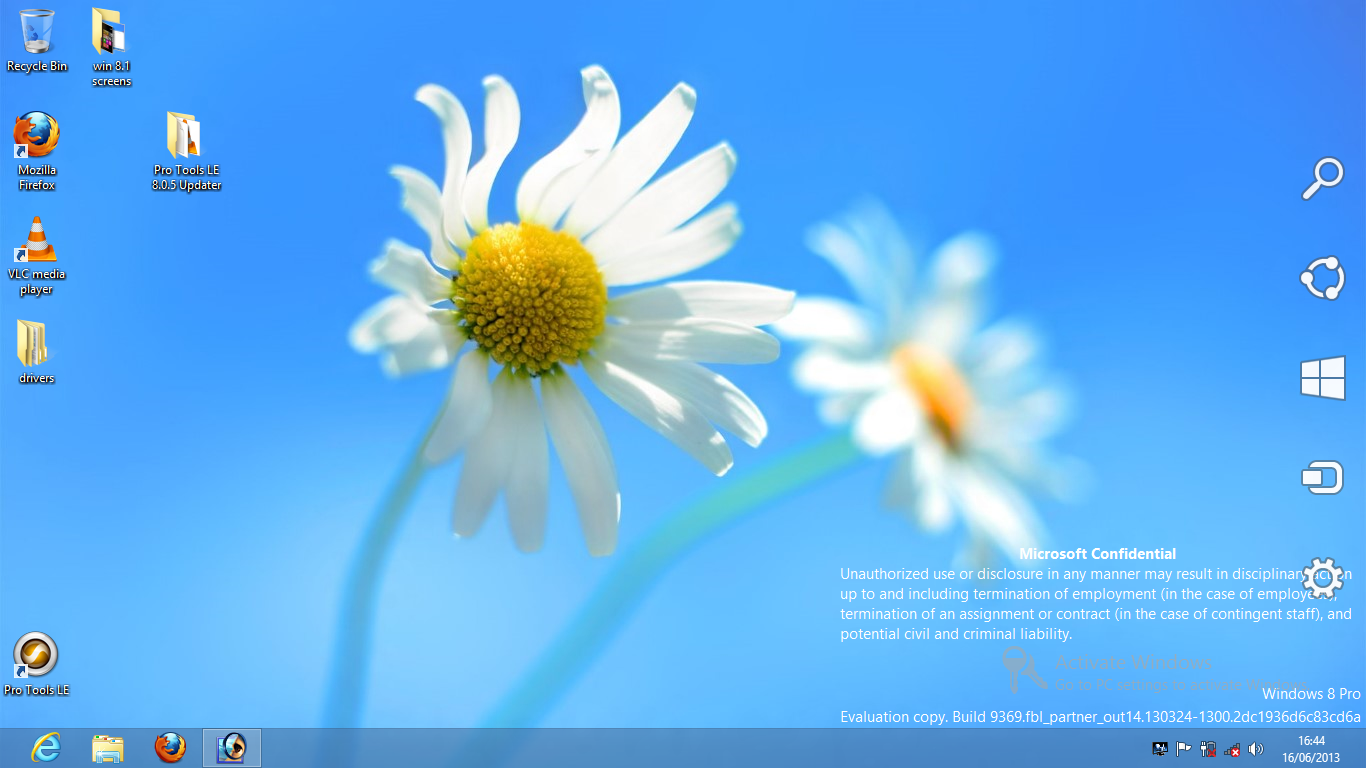
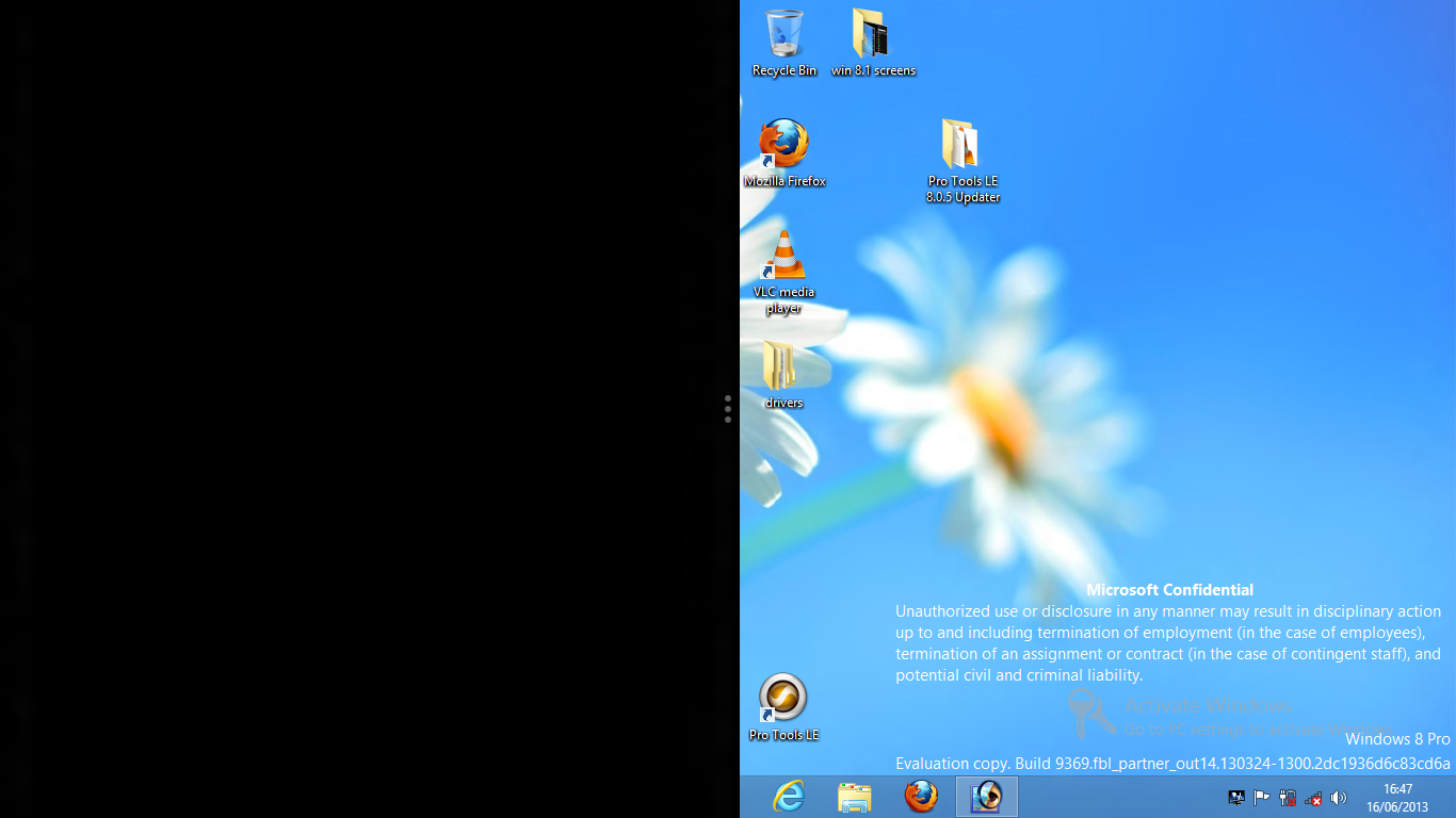
The Desktop
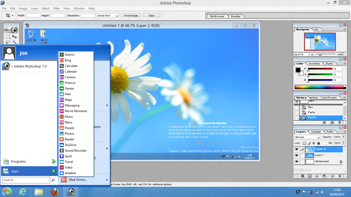
Once you get to the desktop, it’s really quite similar to Windows 7. The only thing that’s different is that there is no start menu. Instead there is a blank space. If you move your mouse down to that corner a button appears which brings you back to the dreadful start screen.
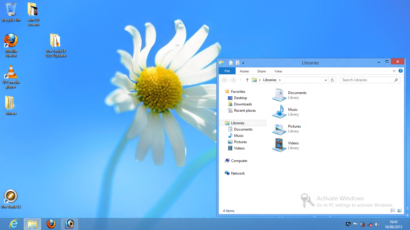
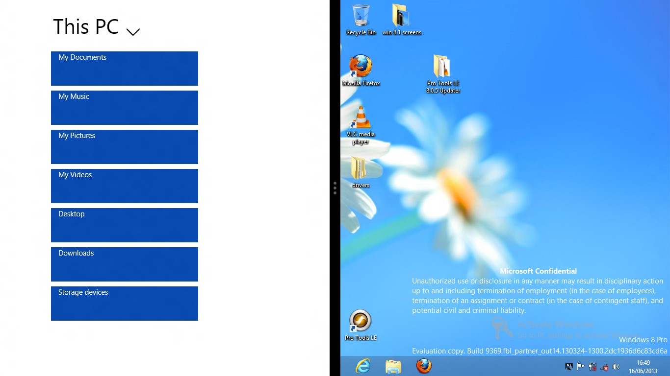
Windows explorer is pretty good and allows access to the folder options very easily:

If you move your mouse to the top right corner, some icons slide onto the screen:
If you move your mouse near them, this happens:

This then gives you yet another way to access the app drawer or change various settings. These things could be much more easily accessed via a start menu and control panel.
If you move your mouse to the top of the screen, the pointer turns into a hand. You can then click and drag the desktop down which makes it smaller and allows you to drag it to the right of the screen and release it, causing this to happen:
If you then click the black area, you are once again faced with the horror of the start screen. If you then click on an app it opens on the left side of the screen:
Why anyone would want to do this is inexplicable to me.
Apps vs programs
I despise the words app and apps. I don’t mind the word application but a computer runs programs. I don’t even mind that the word program is spelled incorrectly thanks to our colonial cousins and their crass simplification of the beautiful English language. The very idea of an app sums up what I hate about modern computing but I digress. There seems to be a clear distinction in Windows 8.1 between apps and programs. Apps are terrible full screen abominations included in the OS (and presumably installable via an app store in the final version) and programs are proper programs like VLC, Firefox and Photoshop. I briefly tried out some of the built in apps but I can’t stand it when I open a program and it instantly full screens. Again this is evidence that Microsoft think that a mobile UI is suitable for a desktop computing experience. Presumably this is their attempt to unify the computing experience across all devices. You’d think they would have learned some lessons from Ubuntu. Seemingly not.
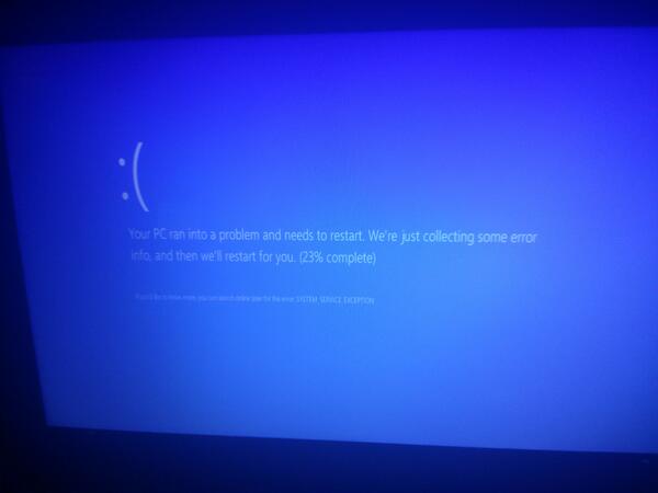
Thankfully you are not (yet) forced to only use the shitty built in apps. Like previous versions of Windows you have a fair bit of control over what you can install. I effortlessly installed Firefox, VLC and my old version of Photoshop and after the usual pissing about I got Pro Tools running. This was no more effort than in Windows 7. I did see a couple of blue screens while trying to get Pro Tools installed but I can’t blame Windows for the inadequacies of the Avid developers. I was amused at what a blue screen looks like these days, though:
Overall impressions
I was tempted to say that I wouldn’t use Windows 8.1 if you paid me but it depends on how much you were willing to spend if I’m being honest. There is no way that I would use it as my main operating system and I plan to keep using Tiny7 for as long as I can for my audio work. There were some positives, though. The main one is speed. It could very well be that because there was no OEM bloatware and that it wasn’t complete enough to contain all of the usual security features that normally bog Windows down but it did seem pretty snappy for a modern operating system. I’m fairly sure that once 8.1 starts coming pre-installed on laptops, it won’t be anywhere near this fast.
A ray of hope
There are people who will just never install a different operating system on their laptop. Some people just don’t have the time and mental energy to try Linux or even install an older version of Windows and find all the drivers etc. These are the kind of people who use Windows 8 and will end up using Windows 8.1. These people have one ray of hope and that is Classic Shell. Free to download (and with a somewhat confusing licence), Classic Shell does what 8.1 was rumoured go be going to do: bring back the start menu and the ability to boot straight to the desktop. No one really knows whether the final release of 8.1 will include these abilities but if it doesn’t, Classic Shell is a must. You can chose between various start menu styles. I picked Windows XP:
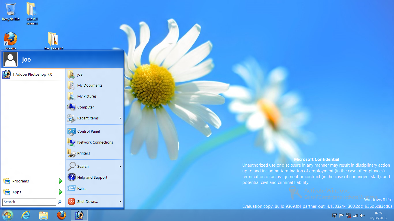
It even separates apps and programs into two different lists:
Even better news is that you can customise the start menu far more than you ever could in XP or 7. The best news is that with Classic Shell installed it boots to the desktop by default.