A look at Windows 8.1

I had an old hard drive lying around so I thought I would take the SSD out of my laptop and install a “leaked” copy of the forthcoming Windows 8.1 (AKA Windows Blue). This isn’t really a review, it’s just some thoughts about it. I didn’t use it for very long so it’s really my first impressions. The version that I installed wasn’t even an official preview so it’s quite likely that by the time it gets released it will be at least a little bit different. It was also missing some key features like the ability to activate it and do Windows updates.

It’s worth mentioning that I have hardly used Windows 8 (apart from a brief look at the official consumer preview just before the final release) so 8.1 might not be very different. I’m really not sure.


Installation

The installer was very much the same as the Windows 7 one. I wasn’t doing any complicated partitioning, I just let Windows install to the entire hard drive. It all went fairly smoothly but it took an awfully long time compared to Xubuntu which wasn’t a surprise. It definitely took longer that Tiny7, a slimmed down version of Windows 7 that I use for audio work, despite being fairly stripped down itself. It did freeze at the final stage of the installation but after a hard reboot it booted into the OS. Presumably once the final version is released this won’t happen.


The start screen

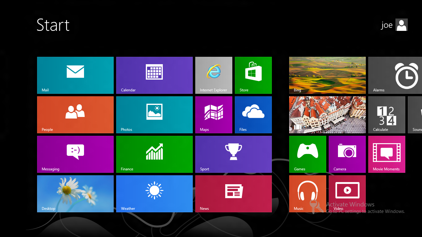
Once it boots, you are faced with the same start screen that comes with Windows 8:

start screen

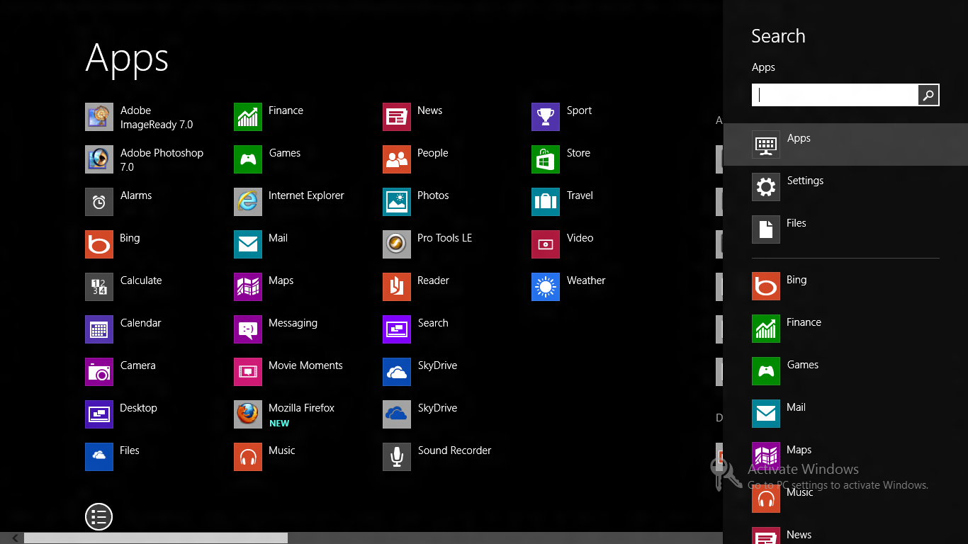
At this point you have several options. You can press escape (or the old Windows key + d) or click on ‘Desktop’ to go to the desktop or you can start typing to bring up the app search. You can also click a button that brings up an Android style ‘app drawer’:


app-drawer


What is there to say about this new approach to interface design that isn’t blindingly obvious and hasn’t been said already? It’s obviously complete and utter shit and whoever came up with Windows 8 should be fired. To be honest I blame the developers of Gnome shell and Unity for this hideous mess. The world is moving away from traditional desktop computing towards touch screen content consumption devices like phones and tablets. As a result of this shift, developers of desktop operating systems are desperately trying to keep up by copying UI elements that clearly don’t work with mouse and keyboard based input. Thank fuck for lighter weight Linux distros and desktop environments.


The Desktop

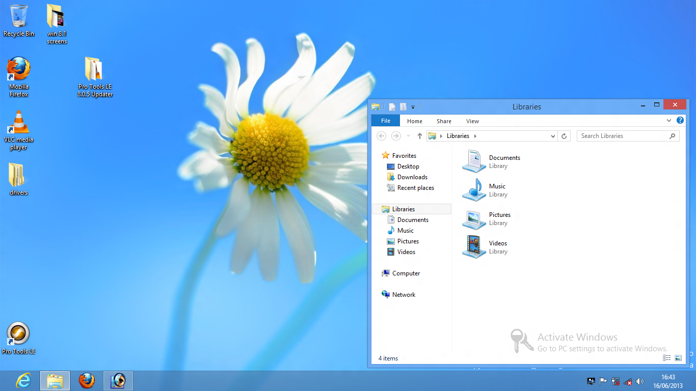
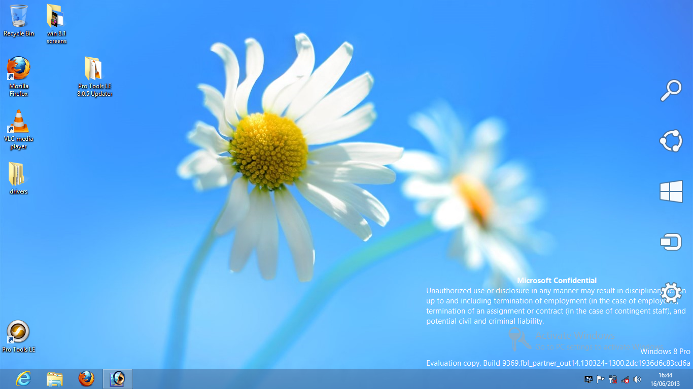
Once you get to the desktop, it’s really quite similar to Windows 7. The only thing that’s different is that there is no start menu. Instead there is a blank space. If you move your mouse down to that corner a button appears which brings you back to the dreadful start screen.

desktop


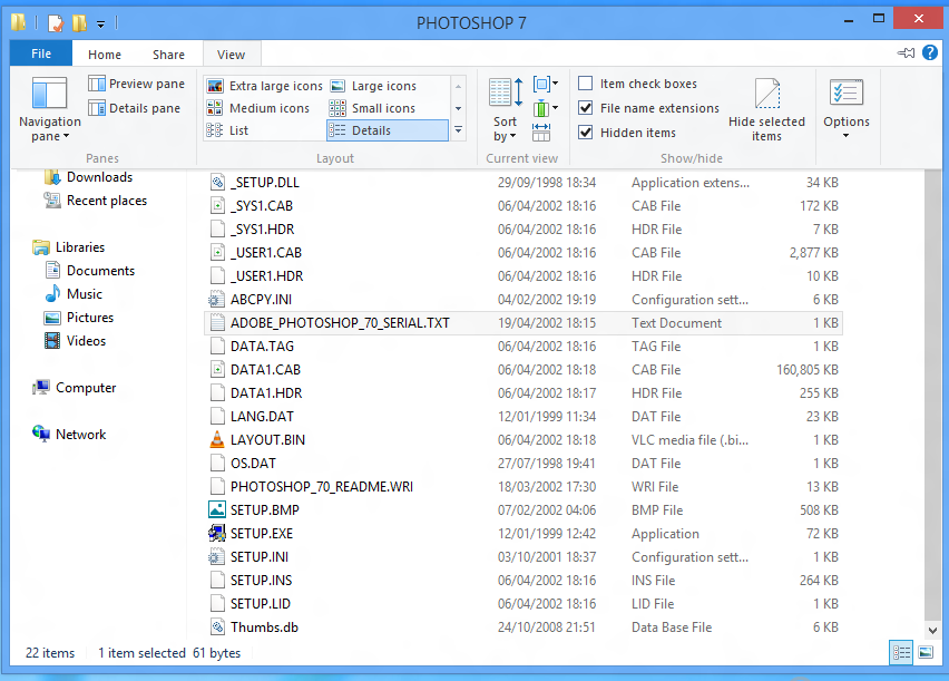
Windows explorer is pretty good and allows access to the folder options very easily:

folder options


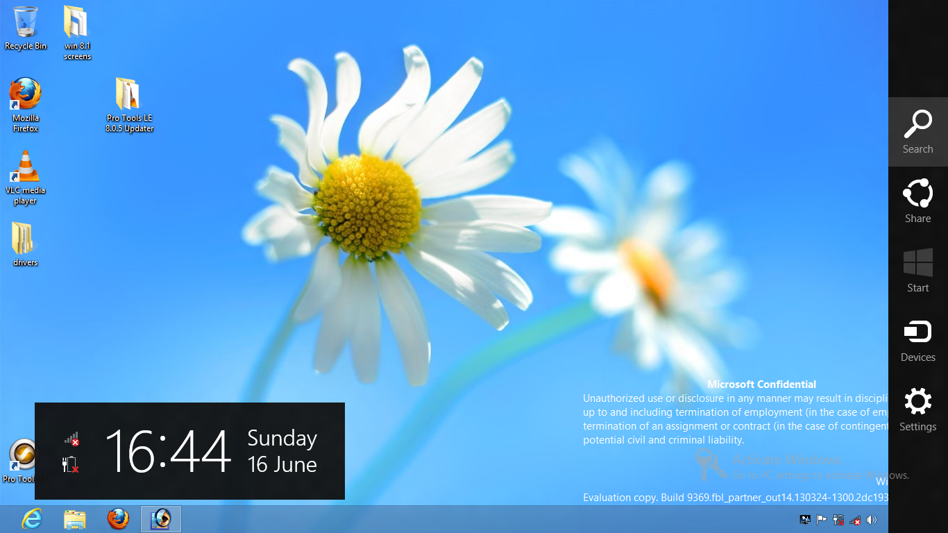
If you move your mouse to the top right corner, some icons slide onto the screen:

corner1


If you move your mouse near them, this happens:

corner2

This then gives you yet another way to access the app drawer or change various settings. These things could be much more easily accessed via a start menu and control panel.


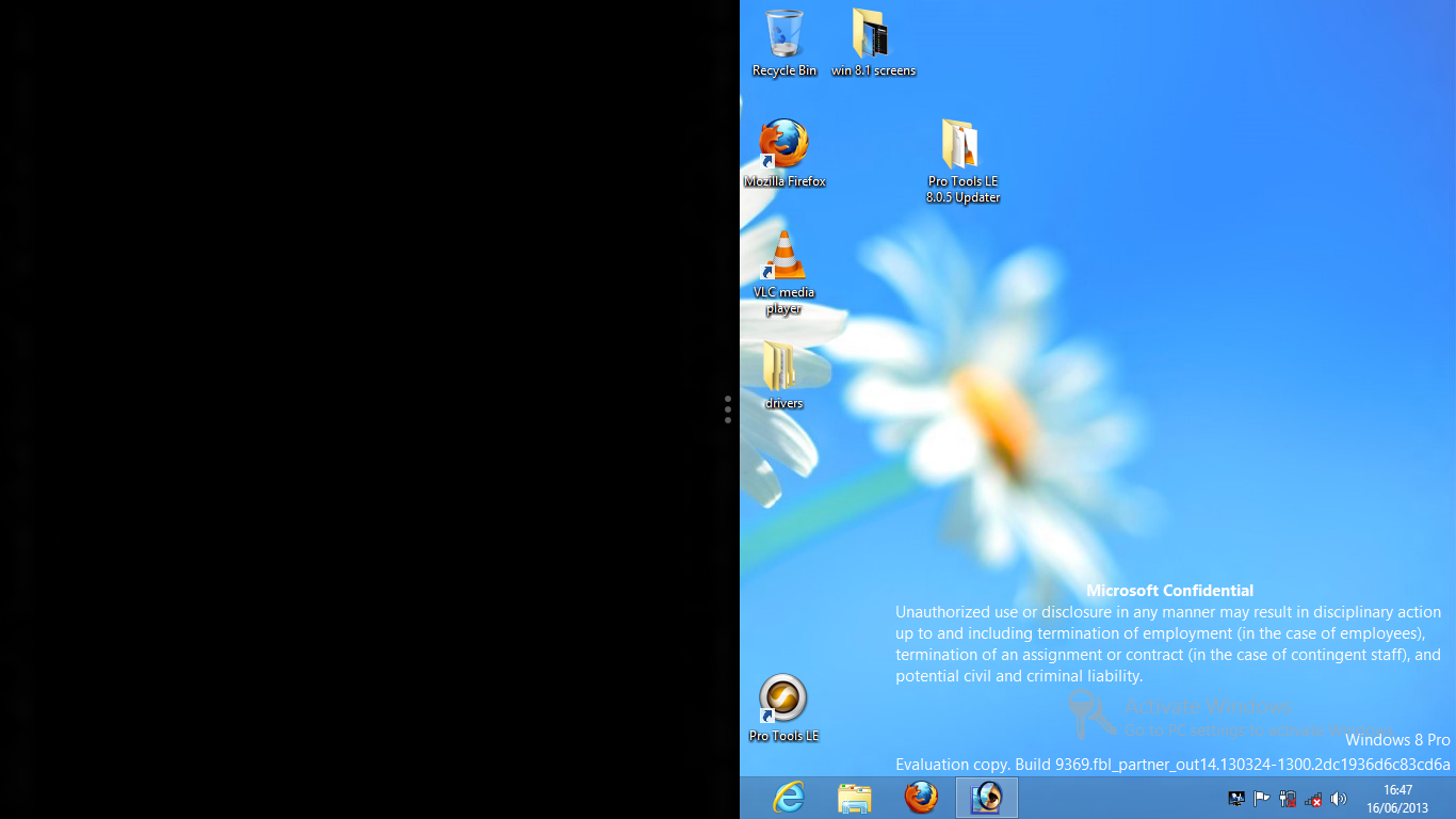
If you move your mouse to the top of the screen, the pointer turns into a hand. You can then click and drag the desktop down which makes it smaller and allows you to drag it to the right of the screen and release it, causing this to happen:

split-screen


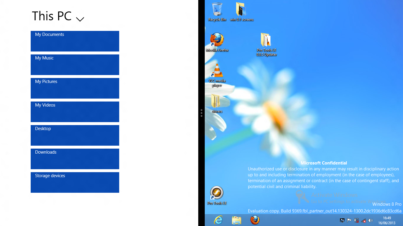
If you then click the black area, you are once again faced with the horror of the start screen. If you then click on an app it opens on the left side of the screen:

split-screen-with-files

Why anyone would want to do this is inexplicable to me.


Apps vs programs

I despise the words app and apps. I don’t mind the word application but a computer runs programs. I don’t even mind that the word program is spelled incorrectly thanks to our colonial cousins and their crass simplification of the beautiful English language. The very idea of an app sums up what I hate about modern computing but I digress. There seems to be a clear distinction in Windows 8.1 between apps and programs. Apps are terrible full screen abominations included in the OS (and presumably installable via an app store in the final version) and programs are proper programs like VLC, Firefox and Photoshop. I briefly tried out some of the built in apps but I can’t stand it when I open a program and it instantly full screens. Again this is evidence that Microsoft think that a mobile UI is suitable for a desktop computing experience. Presumably this is their attempt to unify the computing experience across all devices. You’d think they would have learned some lessons from Ubuntu. Seemingly not.

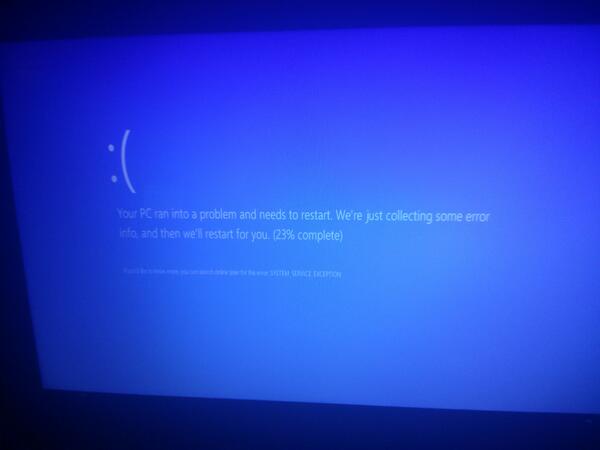
Thankfully you are not (yet) forced to only use the shitty built in apps. Like previous versions of Windows you have a fair bit of control over what you can install. I effortlessly installed Firefox, VLC and my old version of Photoshop and after the usual pissing about I got Pro Tools running. This was no more effort than in Windows 7. I did see a couple of blue screens while trying to get Pro Tools installed but I can’t blame Windows for the inadequacies of the Avid developers. I was amused at what a blue screen looks like these days, though:

blue screen


Overall impressions

I was tempted to say that I wouldn’t use Windows 8.1 if you paid me but it depends on how much you were willing to spend if I’m being honest. There is no way that I would use it as my main operating system and I plan to keep using Tiny7 for as long as I can for my audio work. There were some positives, though. The main one is speed. It could very well be that because there was no OEM bloatware and that it wasn’t complete enough to contain all of the usual security features that normally bog Windows down but it did seem pretty snappy for a modern operating system. I’m fairly sure that once 8.1 starts coming pre-installed on laptops, it won’t be anywhere near this fast.


A ray of hope

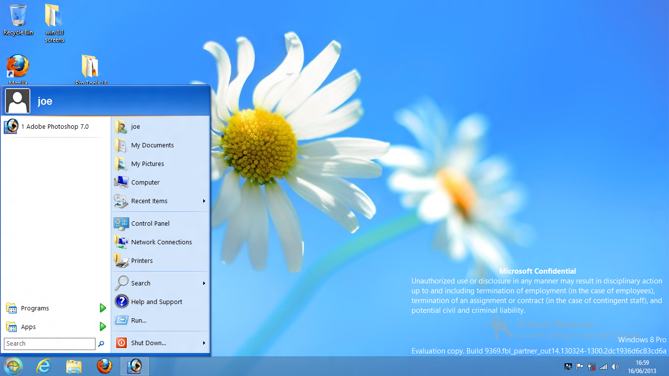
There are people who will just never install a different operating system on their laptop. Some people just don’t have the time and mental energy to try Linux or even install an older version of Windows and find all the drivers etc. These are the kind of people who use Windows 8 and will end up using Windows 8.1. These people have one ray of hope and that is Classic Shell. Free to download (and with a somewhat confusing licence), Classic Shell does what 8.1 was rumoured go be going to do: bring back the start menu and the ability to boot straight to the desktop. No one really knows whether the final release of 8.1 will include these abilities but if it doesn’t, Classic Shell is a must. You can chose between various start menu styles. I picked Windows XP:

start-menu


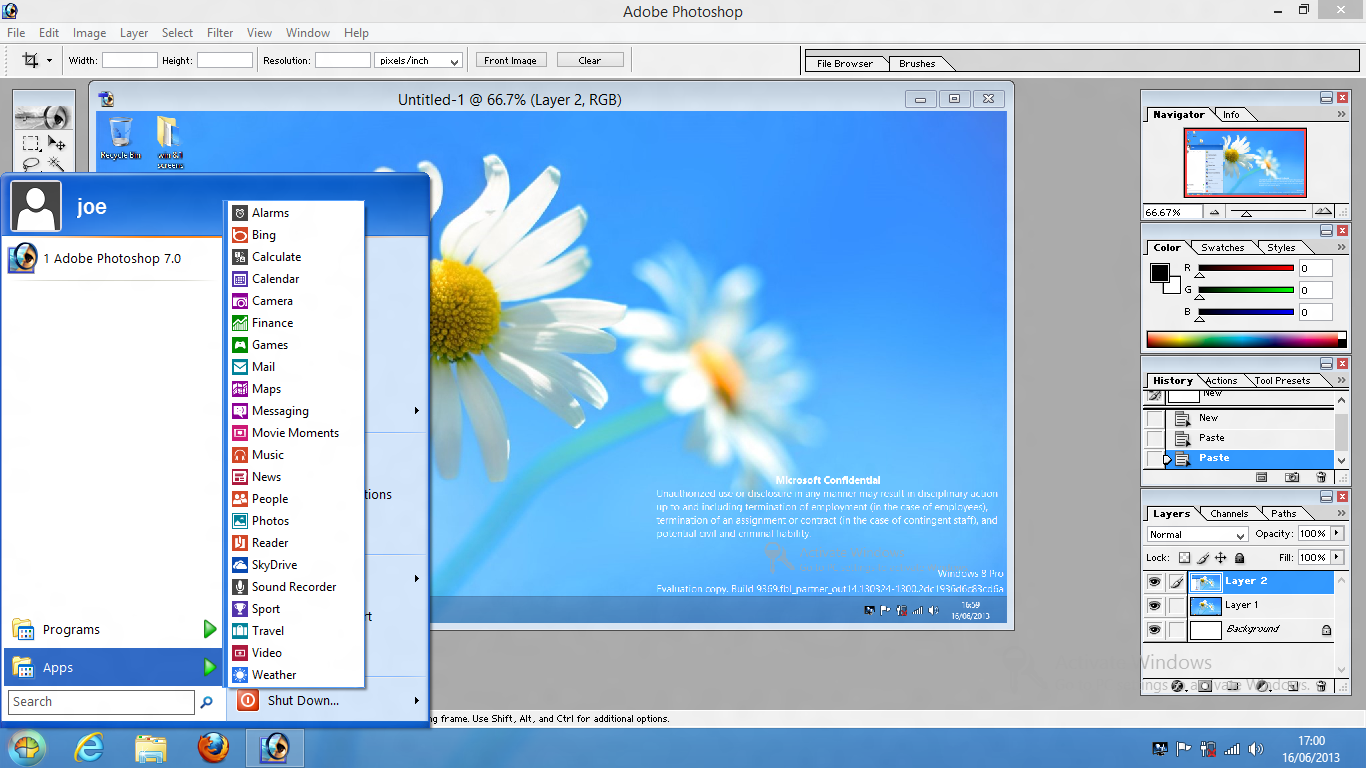
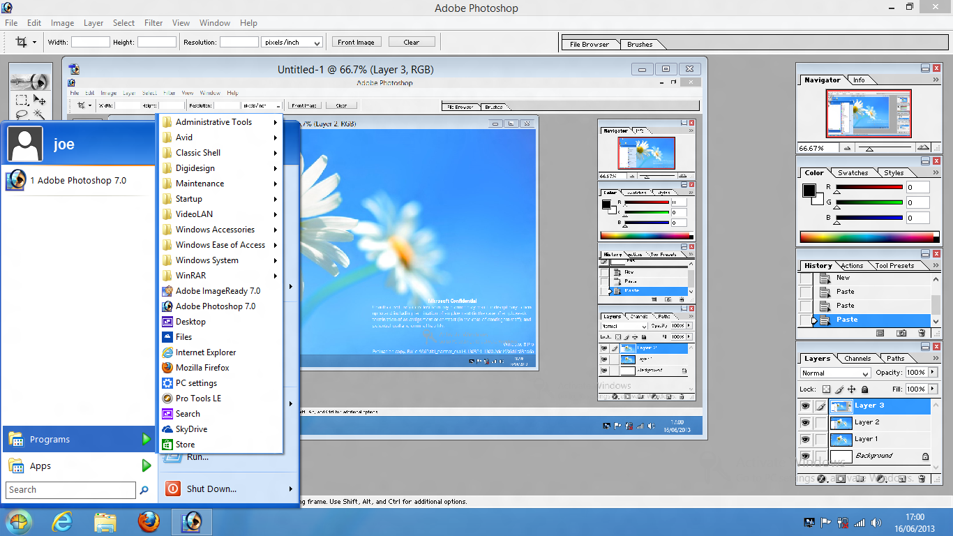
It even separates apps and programs into two different lists:

start-menu-apps


start-menu-programs


Even better news is that you can customise the start menu far more than you ever could in XP or 7. The best news is that with Classic Shell installed it boots to the desktop by default.

Lightweight Desktop Linux

Full featured Linux distros like Linux Mint, Ubuntu, or Fedora are an ideal alternative to Windows or Mac OS X on a modern laptop or desktop computer but not everyone is fortunate enough to have the latest hardware so sometimes a lighter alternative might be more suitable. There are loads of Linux distros out there and a lot of them can be run on extremely old hardware, often with surprising success. This is a summary of some of the lightweight Linux distros and desktop environments that I’ve tried.


Desktop Environments

The main full featured (or big and bloated) desktop environments are Cinnamon (first developed for use in Linux Mint), Mate (a fork of Gnome 2), Gnome 3 (default in Fedora), Unity (first developed and used in Ubuntu) and KDE. I might go into why I don’t use any of those at some point in the future but for now I will be ignoring them.


Xfce

One step down in weight is Xfce. This is what I use on even modern machines that are well capable of running heavier environments. Although it started as a lighter alternative to Gnome, it has steadily increased its footprint and feature set to the point where it is entirely usable as part of an everyday operating system. It’s extremely customisable and can be made to look enough like good old Windows XP to keep me happy. It’s also possible to make it look completely different with docks or by positioning the panel(s) where ever you want them.

Default Xfce (Ubuntu 13.04)

To install it on Ubuntu you have two options. Pure Xfce or Xfce with a few tweaks in the form of Xubuntu. Personally I prefer Xubuntu.

For pure Xfce open a terminal and type

sudo apt-get install xfce4

For Xubuntu type

sudo apt-get install xubuntu-desktop

Once it’s installed just log out and then choose Xfce from the session menu.

session-chooser

The same goes for other desktops.


LXDE

LXDE (Lightweight X11 Desktop Environment) is another step down in weight. In my opinion it is just as usable as Xfce but runs that little bit faster using fewer resources. The only reason that I don’t use it is that I settled on Xfce before I had heard of LXDE and I fear change. I am the type of person who finds something they like and sticks with it. Again it is very customisable and by default looks somewhat like Windows XP in terms of layout. Admittedly it does look a bit old school in its default state but you can change the look and feel very easily to suit your taste.

LXDE was chosen as the default desktop for Rasbian which is the main officially supported distro for the Raspberry Pi.

Default LXDE (Ubuntu 13.04)

Again to install LXDE on Ubuntu you have two options, pure LXDE and Lubuntu.

sudo apt-get install lxde

or

sudo apt-get install lubuntu-desktop


Fluxbox

Fluxbox is a window manager that is very minimal and very lightweight. It does have a taskbar by default but the only way to access programs is to right click on the desktop which brings up a menu. Although it is possible to customise it quite a lot, doing so involves editing configuration text files rather than using a GUI. I wouldn’t really recommend it.

Default Fluxbox (Ubuntu 13.04)

To install it on Ubuntu:

sudo apt-get install fluxbox


Openbox

Very similar to Fluxbox, indeed originally sharing the same roots, Openbox is even more minimal. After installing it on Ubuntu and logging into it, you are met with a plain grey screen. Again right clicking brings up the menu. It’s possible to install panels and docks but again it involves editing config files. Thankfully there are graphical configuration tools to make it easier. LXDE uses Openbox as a base and this shows that it doesn’t have to just be a blank screen. In a choice between Openbox and Fluxbox, Openbox wins hands down.

Default Opebox (Ubuntu 13.04)

To install it in Ubuntu:

sudo apt-get install openbox

If you have LXDE installed, Openbox will already be installed.


Tiling window managers

There are lots of tiling window managers but the whole concept doesn’t appeal to me at all. Some of them are extremely lightweight so I am giving them a brief mention.

There are a myriad of other desktop environments and window managers but I don’t have time to investigate them all.


Lightweight distributions

There are a number of Ubuntu variants that each come with a different desktop environment that has been customised. There are also derivatives of those variants.

For Xfce there is Xubuntu.

For LXDE there is Lubuntu and Peppermint.

For Openbox there is CrunchBang which was originally based on Ubuntu but has since moved to Debian (which is what Ubuntu and all of its derivatives use as a base). Although I haven’t used it for a while, my memory is that it is a really usable distro if you want something really light that can run on old hardware.

Then there are some other lightweight distros. From here on we are entering hobbyist territory. I wouldn’t recommend any of the following for day to day use for various reasons.


Puppy Linux

Puppy Linux is a distro that runs from RAM. It is possible to install it to a hard disk but it is not recommended. The .iso file isn’t much more than 100MB which is pretty small compared to Ubuntu and Mint which are around 1GB. I used it quite a lot 4 or 5 years ago and used to really like it. It was really fast and allowed me to resurrect an ancient IBM Thinkpad A20m (originally running Windows 98) into a machine that was capable of browsing the web and even watching the odd video.

When I decided to write this piece I thought I would have good things to say about Puppy but alas not. It seems that since my last dealings with it, there has been major fragmentation within the project. There are now two websites (puppylinux.org and puppylinux.com), one being called the official site (.com) and the other being called the community site. Both sites have various versions that are compatible with Ubuntu packages and Slackware packages but there seem to be different version numbers of each on each site. Obviously I could investigate this properly and try the various versions but I don’t want to. The nature of free/open source software means that there will always be fragmentation but I think that they should clarify their version system.

I tried two Ubuntu compatible versions and although they had different colours and desktop backgrounds and had slightly different menus, they struck me as broadly similar. I very briefly tried to connect to my wireless network but the wizard failed. Again I could have tried harder like I did back in the day with my Thinkpad but instead I just plugged in my ethernet cable. This time the wizard worked.

One program that I always try to install when I try a new distro is VLC. I do that for two reasons. Firstly it is a great media player that will play almost any video file, regardless of codecs. The second is that it has a lot of dependencies and so it is a good test of distro’s packaging system. Debian (and thus Ubuntu/Mint etc.) uses APT which is a very clever solution to the problem of dependencies. I am used to typing in one command to refresh the list of available packages (apt-get update)  and then one command to install a program (apt-get install vlc). I sometimes use the excellent GUI Synaptic, in which case I just click a button to refresh the package list and then search for, select and install the program. APT makes this process trivial.

With Puppy it is a different story. I admit that I don’t know enough about Puppy to install programs using the command line so I had to rely on GUI tools. I managed to find the package installer from with the menu (each version had it in a different place) and after searching for VLC I clicked on it. It attempted to install it but gave me an error, suggesting that I refresh the package list. The button to do that was two screens deep but I found it. Clicking it in one version caused it to start refreshing and then just freeze. At that point I gave up and tried the other version. I went through the same process only this time the package refresh worked. Slowly. Very slowly in fact. It must have taken about 15 minutes to complete the job. This wasn’t because of slow download speeds, it was because it processed each available package individually and there were an awful lot of individual packages. When it finally finished I installed VLC and it worked very well. I was able to stream a 720p video from my desktop machine and it played perfectly on full screen.

Overall I wouldn’t recommend Puppy for use beyond a bit of tinkering. One of the main reasons for that is that it doesn’t have users and instead always runs as root. Running programs like web browsers and email clients as root is a recipe for disaster so it strikes me as odd that the developers have taken this decision and stuck with it for the ten years of the project’s history.

Puppy Precise
Puppy Precise
Puppy Lucid
Puppy Lucid


Damn Small Linux

Once upon a time, DSL was the daddy of lightweight desktop Linux. At 50MB, it seemed like it wasn’t possible to make a functional operating system any smaller. A lot has happened since 2008 when it last had a stable release and quite frankly it has become irrelevant. I didn’t try the latest release candidate but version 4.4 that I tried seemed pretty terrible. That might sound harsh considering it is such a small .iso and there was a time when it seemed really impressive but now that Tinycore exists I just don’t have much time for it.

I couldn’t get wifi or ethernet working (admittedly I didn’t try very hard at all) and it wouldn’t even boot properly on my old test laptop. Without a network connection there wasn’t much I could do with it. It’s worth checking out briefly, maybe the newer release candidate is much better. Maybe I will revisit it if that ever becomes a stable release. I didn’t use it long enough to work out how to take a screenshot but there are a couple on the project’s website (1 and 2)


Tinycore

Originally derived from Damn Small Linux, Tinycore takes it to the next level. There are 3 versions which are clearly explained on the website. As this is about desktop Linux I will ignore the smallest one which at 8MB only has a command line interface. The 12MB version (called Tinycore) contains just enough to boot to a desktop and install programs. There is also a 64MB version which comes with various programs and utilities.

I tried the 12MB version. It is remarkable that they have managed to develop a usable distro that is so small. By usable I mean I was able to install Firefox and VLC really easily and at least browse to my Desktop and stream a video. There was no sound and the screen resolution wasn’t right, despite my brief attempt to correct it. I’m really impressed with Tinycore and think that if I spent enough time with it I could customise it enough to do almost everything I can do with a fuller featured distro like Xubuntu. Unfortunately I don’t have the time so I won’t be doing that.

I highly recommend checking it out. It is after all a very small download that can be put onto a USB stick using Unetbootin. It definitely wins the prize for size vs usability.

Tinycore
Tinycore


In conclusion

If you have a modern machine and want it to work perfectly and absolutely fly then I recommend Xubuntu.

If you have a slightly older but still reasonable machine then I recommend Lubuntu.

If you have a machine that has seen better days then I recommend Crunchbang.

If you have an ancient machine or just like tinkering then I recommend Tinycore.


Obviously this is not an exhaustive list and there are hundreds of lightweight distros out there. This is just my round up of a few of them.

Also this round up is very Debian/Ubuntu centric. That’s because having tried most of the major distros, I believe Debian to be by far the best base and Ubuntu (minus Unity) to be the best overall distro.

Always use a screen protector

Today I managed to not only drop my phone face down as I was getting out of the car, I managed to step on it and push it along the ground for a few inches. When I picked it up I was faced with this:

Image

Thankfully almost all of the damage was done to the screen protector and not the phone. When I took it off it was fine (except for a few small scratches on the bezel):

noscreenprotector

I think my case also helped.